pyplot的基礎圖標函數
| 函數 | 說明 |
| plt.plot(x,y,fmt,…) | 繪製一個座標圖 |
| plt.boxplot(data,notch,position) | 繪製一個箱形圖 |
| plt.bar(left,height,width,bottom) | 繪製一個條形圖 |
| plt.barh(width,bottom,left,height) | 繪製一個橫向條形圖 |
| plt.polar(theta, r) | 繪製極座標圖 |
| plt.pie(data, explode) | 繪製餅圖 |
| plt.psd(x,NFFT=256,pad_to,Fs) | 繪製功率譜密度圖 |
| plt.specgram(x,NFFT=256,pad_to,F) | 繪製譜圖 |
| plt.cohere(x,y,NFFT=256,Fs) | 繪製X‐Y的相關性函數 |
| plt.scatter(x,y) | 繪製散點圖,其中,x和y長度相同 |
| plt.step(x,y,where) | 繪製步階圖 |
| plt.hist(x,bins,normed) | 繪製直方圖 |
| plt.contour(X,Y,Z,N) | 繪製等值圖 |
| plt.vlines() | 繪製垂直圖 |
| plt.stem(x,y,linefmt,markerfmt) | 繪製柴火圖 |
| plt.plot_date() | 繪製數據日期 |
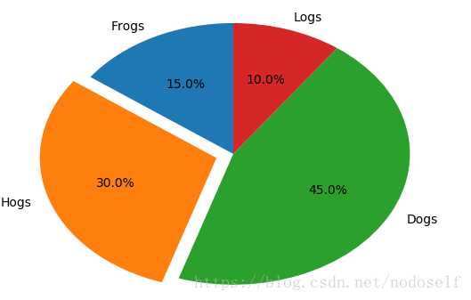
pyplot餅圖的繪製
實例1:
import matplotlib.gridspec as gridspec
import matplotlib.pyplot as plt

labels='Frogs','Hogs','Dogs','Logs'
sizes=[15,30,45,10]
explode=(0,0.1,0,0)
plt.pie(sizes,explode=explode,labels=labels,autopct='%1.1f%%',
        shadow=False,startangle=90)
plt.show()
實例2:
import matplotlib.gridspec as gridspec
import matplotlib.pyplot as plt

labels='Frogs','Hogs','Dogs','Logs'
sizes=[15,30,45,10]
explode=(0,0.1,0,0)
plt.pie(sizes,explode=explode,labels=labels,autopct='%1.1f%%',
        shadow=False,startangle=90)
plt.axis('equal')
plt.show()

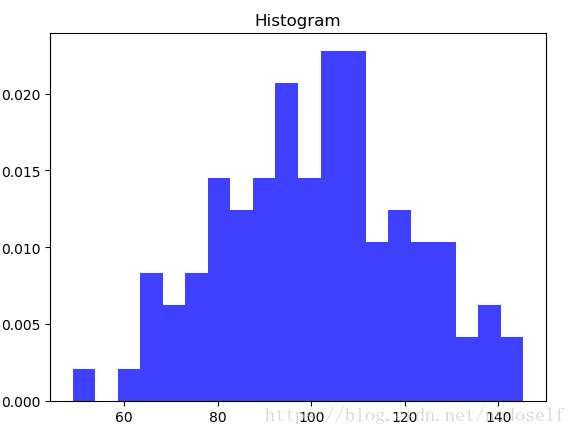
pyplot直方圖的繪製
實例1:
import numpy as np
import matplotlib.pyplot as plt

np.random.seed(0)
mu,sigma=100,20
a=np.random.normal(mu,sigma,size=100)

plt.hist(a,20,normed=1,histtype='stepfilled',facecolor='b',alpha=0.75)
plt.title('Histogram')

plt.show()
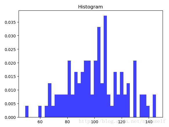
實例2:
import numpy as np
import matplotlib.pyplot as plt

np.random.seed(0)
mu,sigma=100,20
a=np.random.normal(mu,sigma,size=100)

plt.hist(a,40,normed=1,histtype='stepfilled',facecolor='b',alpha=0.75)
plt.title('Histogram')

plt.show()
pyplot極座標圖的繪製
面向對象繪製極座標
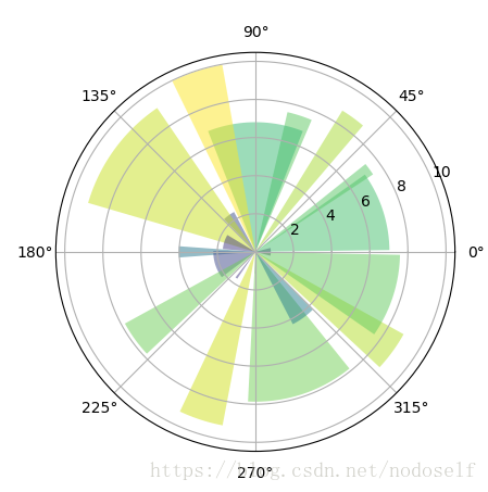
實例1:
import numpy as np
import matplotlib.pyplot as plt

N=20
theta=np.linspace(0.0,2*np.pi,N,endpoint=False)
radii=10*np.random.rand(N)
width=np.pi/4*np.random.rand(N)

ax=plt.subplot(111,projection='polar')
bars=ax.bar(theta,radii,width=width,bottom=0.0)

for r,bar in zip(radii,bars):
    bar.set_facecolor(plt.cm.viridis(r/10.))
    bar.set_alpha(0.5)

plt.show()
實例2:
import numpy as np
import matplotlib.pyplot as plt

N=10
theta=np.linspace(0.0,2*np.pi,N,endpoint=False)
radii=10*np.random.rand(N)
width=np.pi/2*np.random.rand(N)

ax=plt.subplot(111,projection='polar')
bars=ax.bar(theta,radii,width=width,bottom=0.0)

for r,bar in zip(radii,bars):
    bar.set_facecolor(plt.cm.viridis(r/10.))
    bar.set_alpha(0.5)

plt.show()

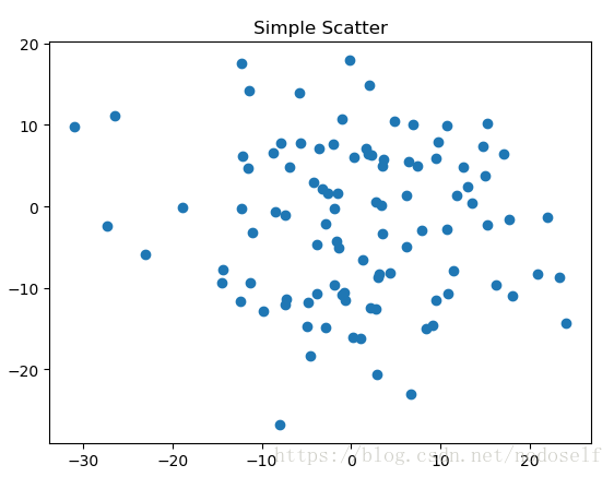
pyplot散點圖的繪製
實例:
import matplotlib.pyplot as plt
import numpy as np

fig,ax=plt.subplots()
ax.plot(10*np.random.randn(100),10*np.random.randn(100),'o')
ax.set_title('Simple Scatter')
plt.show()