


參考鏈接:http://www.ncloud.hk/%E6%8A%80%E6%9C%AF%E5%88%86%E4%BA%AB/react-native%E5%B8%83%E5%B1%80/
一、寬度和像素密度:
(1)首先你我們需要了解iPhone的各個尺寸:iphone 4s 3.5Screen、iphone 5 4Screen、iphone 6 4.7Screen、iphone 6 Plus 5.5 Screen
這個剛開始的時候對佈局規劃不是很好,沒有考慮到兼容什麼的,導致到最後浪費了好些時間(一般初學者都會忽略這些屏幕適配的問題)。
具體:var DimenSions=require('Dimensions');
var windowSize=Dimensions.get('window')
<View style={{width:windowSize.width,height:windowSize.height}}>
<Text>....</Text>
</View>
二、Flex的簡單佈局
(1)flex佈局定義?
flex佈局是flexible box 的縮寫,意爲"彈性佈局",用來爲盒狀模型提供最大的靈活性。
(2)適用條件:任何一個容器都可以指定爲flex佈局(比如你要做一個表格,那麼就需要均等分配,這個時候你就可以使用flex佈局)。
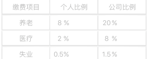
View style={styles.border1}> <View style={{flexDirection:'row',flex1,borderColor:'#e7e7e7',borderWidth:1}}> <View style={{flex:1, justifyContent:'center', alignItems:'center',borderColor:'#e7e7e7',borderWidth:1}}> <Text style={styles.color1}>繳費項目</Text> </View> <View style={{flex:1, justifyContent:'center', alignItems:'center',borderColor:'#e7e7e7',borderWidth:1}}> <Text style={styles.color1}>個人比例</Text> </View> <View style={{flex:1, justifyContent:'center', alignItems:'center',borderColor:'#e7e7e7',borderWidth:1}}> <Text style={styles.color1}>公司比例</Text> </View> </View>
(3)flex中子佈局與父佈局的關係:子佈局依賴與父佈局 |
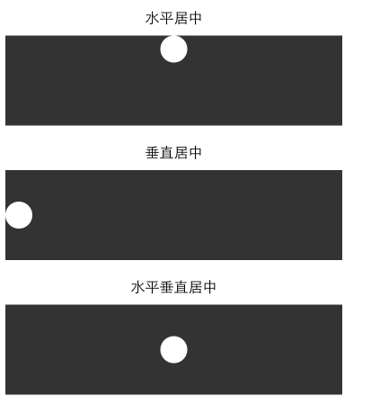
三、水平與垂直居中(alignItems、justifyContent)
<Text style={[styles.text, styles.header]}>
水平居中
</Text>
<View style={{height: 100, backgroundColor: '#333333', alignItems: 'center'}}>
<View style={{backgroundColor: '#fefefe', width: 30, height: 30, borderRadius: 15}}/>
</View>
<Text style={[styles.text, styles.header]}>
垂直居中
</Text>
<View style={{height: 100, backgroundColor: '#333333', justifyContent: 'center'}}>
<View style={{backgroundColor: '#fefefe', width: 30, height: 30, borderRadius: 15}}/>
</View>
<Text style={[styles.text, styles.header]}>
水平垂直居中
</Text>
<View style={{height: 100, backgroundColor: '#333333', alignItems: 'center', justifyContent: 'center'}}>
<View style={{backgroundColor: '#fefefe', width: 30, height: 30, borderRadius: 15}}/>
</View>
四、圖片佈局:
圖片佈局有一個stretchMode.通過Image.resizeMode進行訪問 var keys=Objec.keys(Image.resizeMode).join(''); 使用圖片資源的兩種方式 (1)使用本地的資源 <Image source={require('./my-icon.png')}> 但是有人也這樣寫 <Image source={require(images!my-icon.png)}>兩者都可以。 (2)使用網絡圖片 <Image source={{uri:'圖片的鏈接地址'}}> 可以通過設置圖片的Style屬性來對圖片進行設置 var style=StyleSheet.create({ width: height: flex: }) |
五、padding和margin
padding的語法結構:padding:10 , paddingLeft,paddingTop
margin的語法跟Padding一樣;marginLeft:10,marginRight:10,marginTop
我們很多時候都在糾結於到底是用margin還是Padding,這兩者之間有有什麼區別:
1.padding 是屬性定義的元素邊框與元素之間的控件(指的是內邊距)
2.margin指的是外邊距
example:
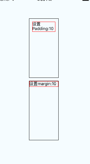
(1)分別在文本上設置margin:10和padding:10:
<View style={styles.container}> <View style={{width:100,height:200,borderColor:'black',borderWidth:1}}> <Text style={{padding:10,borderColor:'red',borderWidth:1}}>設置Padding:10 </Text> </View> <View style={{width:100,height:200,borderColor:'black',borderWidth:1}}> <Text style={{margin:10,borderColor:'red',borderWidth:1}}>設置margin:10 </Text> </View> </View>
|
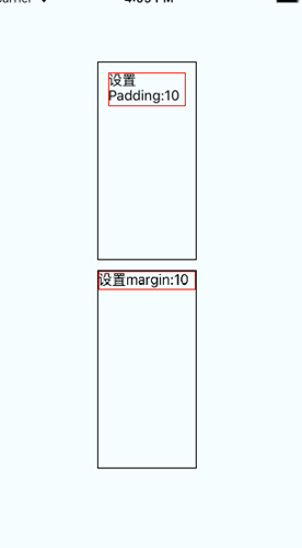
(2)分別在View上設置margin:10和padding:10
<View style={styles.container}>
<View style={{padding:10,width:100,height:200,borderColor:'black',borderWidth:1}}>
<Text style={{borderColor:'red',borderWidth:1}}>設置Padding:10 </Text>
</View>
<View style={{margin:10,width:100,height:200,borderColor:'black',borderWidth:1}}>
<Text style={{borderColor:'red',borderWidth:1}}>設置margin:10 </Text>
</View>
</View>