


一些常用css總結,方便查詢
1. 顏色屬性:
color
HEX(十六進制色:color: #FFFF00 --> 縮寫:#FF0)
RGB(紅綠藍,使用方式:color:rgb(255,255,0)或者color:rgb(100%,100%,0%))
RGBA(紅綠藍透明度,A是透明度在0~1之間取值。使用方式:color:rgba(255,255,0,0.5))
HSL(CSS3有效,H表示色調,S表示飽和度,L表示亮度,使用方式:color:hsl(360,100%,50%))
HSLA(和HSL相似,A表示Alpha透明度,取值0~1之間。)
transparent
全透明,使用方式:color: transparent;
opacity
元素的透明度,語法:opacity: 0.5;
屬性值在0.0到1.0範圍內,0表示透明,1表示不透明。
filter濾鏡屬性(只適用於早期的IE瀏覽器,語法:filter:alpha(opacity:20);)。
2. 字體屬性:
font-style: 用於規定斜體文本
normal 文本正常顯示
italic 文本斜體顯示
oblique 文本傾斜顯示
font-weight: 設置文本的粗細
normal(默認)
bold(加粗)
bolder(相當於<strong>和<b>標籤)
lighter (常規)
100 ~ 900 整百(400=normal,700=bold)
font-size: 設置字體的大小
默認值:medium
<absolute-size>可選參數值:xx-small、 x-small、 small、 medium、 large、 x-large、 xx-large
<relative-size>相對於父標籤中字體的尺寸進行調節。可選參數值:smaller、 larger
<percentage>百分比指定文字大小。
<length>用長度值指定文字大小,不允許負值。
font-family:字體名稱
使用逗號隔開多種字體(優先級從前向後,如果系統中沒有找到當前字體,則往後面尋找)
font:簡寫屬性
語法:font:字體大小/行高 字體;(字體要在最後)
3. 文本屬性:
white-space: 設置元素中空白的處理方式
normal:默認處理方式。
pre:保留空格,當文字超出邊界時不換行
nowrap:不保留空格,強制在同一行內顯示所有文本,直到文本結束或者碰到br標籤
pre-wrap:保留空格,當文字碰到邊界時換行
pre-line:不保留空格,保留文字的換行,當文字碰到邊界時換行
direction: 規定文本的方向
ltr 默認,文本方向從左到右。
rtl 文本方向從右到左。
text-align: 文本的水平對齊方式
left
center
right
line-height: 文本行高
normal 默認
vertical-align: 文本所在行高的垂直對齊方式
baseline 默認
sub 垂直對齊文本的下標,和<sub>標籤一樣的效果
super 垂直對齊文本的上標,和<sup>標籤一樣的效果
top 對象的頂端與所在容器的頂端對齊
text-top 對象的頂端與所在行文字頂端對齊
middle 元素對象基於基線垂直對齊
bottom 對象的底端與所在行的文字底部對齊
text-bottom 對象的底端與所在行文字的底端對齊
text-indent: 文本縮進
letter-spacing: 添加字母之間的空白
word-spacing: 添加每個單詞之間的空白
text-transform: 屬性控制文本的大小寫
capitalize 文本中的每個單詞以大寫字母開頭。
uppercase 定義僅有大寫字母。
lowercase 定義僅有小寫字母。
text-overflow: 文本溢出樣式
clip 修剪文本。
ellipsis 顯示省略符號...來代表被修剪的文本。
string 使用給定的字符串來代表被修剪的文本。
text-decoration: 文本的裝飾
none 默認。
underline 下劃線。
overline 上劃線。
line-through 中線。
text-shadow:文本陰影
第一個參數是左右位置
第二個參數是上下位置
第三個參數是虛化效果
第四個參數是顏色
text-shadow: 5px 5px 5px #888;
word-wrap:自動換行
word-wrap: break-word;
4. 背景屬性
背景顏色
background-image 設置圖像爲背景
url("http://images.cnblogs.com/cnblogs_com/suoning/845162/o_ns.png"); 圖片地址
background-image:linear-gradient(green,blue,yellow,red,black); 顏色漸變效果
background-position 設置背景圖像的位置座標
background-position: center center; 圖片置中,x軸center,y軸center
1px -195px 截取圖片某部分,分別代表座標x,y軸
background-repeat 設置背景圖像不重複平鋪
no-repeat 設置圖像不重複,常用
round 自動縮放直到適應並填充滿整個容器
space 以相同的間距平鋪且填充滿整個容器
background-attachment 背景圖像是否固定或者隨着頁面的其餘部分滾動
background 簡寫
background: url("o_ns.png") no-repeat 0 -196px;
background: url("o_ns.png") no-repeat center bottom 15px;
background: url("o_ns.png") no-repeat left 30px bottom 15px;
5. 列表屬性
list-style-type: 列表項標誌的類型
none 去除標誌
decimal-leading-zero; 02.
square; 方框
circle; 空心圓
upper-alph; & disc; 實心圓
list-style-image:將圖象設置爲列表項標誌
list-style-position:列表項標誌的位置
inside
outside
list-style:縮寫
1. 邊框
border-style:邊框樣式
solid 默認,實線
double 雙線
dotted 點狀線條
dashed 虛線
border-color:邊框顏色
border-width:邊框寬度
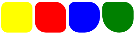
border-radius:圓角
1個參數:四個角都應用
2個參數:第一個參數應用於 左上、右下;第二個參數應用於 左下、右上
3個參數:第一個參數應用於 左上;第二個參數應用於 左下、右上;第三個參數應用於右下
4個參數:左上、右上、右下、左下(順時針)
border: 簡寫
border: 2px yellow solid;
box-shadow:邊框陰影
第一個參數是左右位置
第二個參數是上下位置
第三個參數是虛化效果
第四個參數是顏色
box-shadow: 10px 10px 5px #888;
一些邊框的實現案例:

<!DOCTYPE html>
<html lang="en">
<head>
    <meta charset="UTF-8">
    <title>Title</title>
    <style>
        .radius1 {
            display: inline-block;
            width: 100px;
            height: 100px;
            background-color: yellow;
            border-radius: 20px;
        }
        .radius2 {
            display: inline-block;
            width: 100px;
            height: 100px;
            background-color: red;
            border-radius: 20px 35px;
        }
        .radius3 {
            display: inline-block;
            width: 100px;
            height: 100px;
            background-color: blue;
            border-radius: 20px 35px 50px;
        }
        .radius4 {
            display: inline-block;
            width: 100px;
            height: 100px;
            background-color: green;
            border-radius: 20px 35px 50px 60px;
        }
    </style>
</head>
<body>
    <div>
        <span class="radius1"></span>
        <span class="radius2"></span>
        <span class="radius3"></span>
        <span class="radius4"></span>
    </div>
</body>
</html>
邊框實現各種三角符號:


<!DOCTYPE html>
<html lang="en">
<head>
    <meta charset="UTF-8">
    <title>Title</title>
    <style>
        .triangle-one {
            display: inline-block;
            border-top: 50px red solid;
            border-right: 50px green solid;
            border-bottom: 50px yellow solid;
            border-left: 50px blue solid;
        }
        .triangle-two {
            display: inline-block;
            border-top: 0 red solid;
            border-right: 50px green solid;
            border-bottom: 50px yellow solid;
            border-left: 50px blue solid;
        }
        .triangle-stree {
            display: inline-block;
            border-top: 50px red solid;
            border-right: 0 green solid;
            border-bottom: 50px yellow solid;
            border-left: 50px blue solid;
        }
        .triangle-four {
            display: inline-block;
            border-top: 50px red solid;
            border-right: 0 green solid;
            border-bottom: 0 yellow solid;
            border-left: 50px blue solid;
        }

        .triangle-five {
            display: inline-block;
            border: 50px transparent solid;
            border-top: 50px red solid;
        }
        .triangle-six {
            display: inline-block;
            border: 50px transparent solid;
            border-bottom: 50px yellow solid;
        }
        .triangle-seven {
            display: inline-block;
            border: 50px transparent solid;
            border-top: 60px red solid;
            border-right: 0;
        }
        .triangle-eight {
            display: inline-block;
            border: 50px transparent solid;
            border-left: 30px yellow solid;
            border-bottom: 0;
        }
    </style>
</head>
<body>
    <div class="triangle-one"></div>
    <div class="triangle-two"></div>
    <div class="triangle-stree"></div>
    <div class="triangle-four"></div>
    <div class="triangle-five"></div>
    <div class="triangle-six"></div>
    <div class="triangle-seven"></div>
    <div class="triangle-eight"></div>
</body>
</html>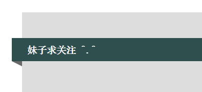
<!DOCTYPE html>
<html lang="en">
<head>
<meta charset="UTF-8">
<title>Title</title>
<style>
.back {
width: 1000px;
height: 1000px;
margin: 0 auto;
background-color: #ddd;
position: relative;
}
.back-in {
position: absolute;
width: 1020px;
height: 45px;
left: -20px;
top: 50px;
background-color: #2F4F4F;
}
.back-img {
border: 20px solid transparent;
border-top: 10px solid dimgrey;
border-right: 0;
display: inline-block;
position: absolute;
top: 95px;
left: -20px;
}
.back-font {
line-height: 9px;
margin-left: 30px;
color: white;
}
</style>
</head>
<body>
<div class="back">
<div class="back-in"><h3 class="back-font">妹子求關注 ^.^</h3></div>
<div class="back-img"></div>
</div>
</body>
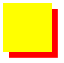
</html>z-index 元素層疊順序
z-index 僅在定位元素上有效(例:position:absolute;)
可以指定負數屬性值(例:-1;)

代碼:
<!DOCTYPE html>
<html lang="en">
<head>
    <meta charset="UTF-8">
    <title>Title</title>
    <style>
        .z-index1 {
            width: 100px;
            height: 100px;
            background-color: yellow;
            position: absolute;
            z-index: -1;
        }
        .z-index2 {
            width: 100px;
            height: 100px;
            background-color: red;
            position: absolute;
            top: 20px;
            left: 20px;
            z-index: 5;
        }
    </style>
</head>
<body>
    <div class="z-index1"></div>
    <div class="z-index2"></div>
</body>
</html>
outline 邊框輪廓
outline-width 輪廓寬度
outline-color 輪廓顏色
outline-style 輪廓樣式

zoom 縮放比例
<!DOCTYPE html>
<html lang="en">
<head>
    <meta charset="UTF-8">
    <title>Title</title>
    <style>
        .zoom1 {
            zoom: 100%;
        }
        .zoom2 {
            zoom: 150%;
        }
        .zoom3 {
            zoom: 200%;
        }
    </style>
</head>
<body>
    <div class="zoom1">Nick 100%</div>
    <div class="zoom2">Nick 200%</div>
    <div class="zoom3">Nick 300%</div>
</body>
</html>
cursor 鼠標的類型形狀
鼠標放在以下單詞上,There will be a miracle:
url: 自定義光標
Auto: 默認
Default: 默認
e-resize
ne-resize
nw-resize
n-resize
se-resize
sw-resize
s-resize
w-resize
Crosshair
Pointer
Move
text
wait
help
自定義光標實例


<!DOCTYPE html>
<html lang="en">
<head>
    <meta charset="UTF-8">
    <title>Title</title>
    <!--<link href="cc2.css" rel="stylesheet" type="text/css">-->
    <style>
        body {
            cursor: url("mouse.png"), auto;
            /*圖片地址:http://images.cnblogs.com/cnblogs_com/suoning/845162/o_mouse.png*/
        }
    </style>
</head>
<body>
    <div><img src="http://images.cnblogs.com/cnblogs_com/suoning/845162/o_ns.png" height="100%" width="100%"></div>
</body>
</html>
transform、transition 動畫效果
transform 轉換,變形
origin 定義旋轉基點(left top center right bottom 座標值) transform-origin: 50px 50px; transform-origin: left;。
rotate 旋轉 transform:rotate(50deg) 旋轉角度可以爲負數,需要先定義origin。
skew 扭曲 transform:skew(50deg,50deg) 分別爲相對x軸傾斜,相對y軸傾斜。
scale 縮放 transform:scale(2,3) 橫向放大2倍,縱向放大3倍;transform:scale(2) 橫豎都放大2倍。
translate 移動 transform:translate(50px, 50px) 分別爲相對x軸移動,相對y軸移動。
<!DOCTYPE html>
<html>
<head>
    <meta http-equiv="Content-Type" content="text/html; charset=utf-8" />
    <title>nick</title>
    <meta charset="utf-8" />
    <style type="text/css">
        div {
            border: 1px solid black;
            height: 30px;
            width: 30px;
            background-color: yellow;

            /*transform-origin: 50px 50px;*/
            transform-origin: left;
            transform: rotate(50deg);
            /*transform: skew(50deg,50deg);*/
            /*transform: translate(50px,50px);*/
            /*transform: scale(2);*/
        }
    </style>
</head>
<body>
    <div></div>
</body>
</html>
Transition 平滑過渡
transition-property: 變換的屬性(none(沒有屬性改變)、all(所有屬性改變)、具體屬性)
transition-duration: 變換持續時間
transition-timing-function: 變換的速率(ease:(逐漸變慢)、linear:(勻速)、ease-in:(加速)、ease-out:(減速)、ease-in-out:(加速然後減速)、cubic-bezier:(自定義時間曲線))
transition-delay: 變換延遲時間
transition: 縮寫
圖標
一般實現製作圖標有三種方式:
圖片(自定義)
CSS實現
fontawsome
本例引用第三方,fontawsome,網址:http://fontawesome.io/icons/
首先下載解壓,引用,使用方法,例:
<!DOCTYPE html>
<html lang="en">
<!--圖標-->
<head>
    <meta charset="UTF-8">
    <title>Title</title>
    <link rel="stylesheet" href="font-awesome/css/font-awesome.css">
</head>
<body>
    <span class="icon-dollar"></span>
</body>
</html>
important
CSS寫在不同的地方有不同的優先級, .css文件中的定義 < 元素style中的屬性,但是如果使用!important,事情就會變得不一樣
css定義中的用!important限定的定義卻是優先級最高的
格式:Tag:css !important
important應用

<!DOCTYPE html>
<html lang="en">
<!--important-->
<head>
    <meta charset="UTF-8">
    <title>Title</title>
    <style>
        div{
            font-size: 16px;
            color: red;
            font-weight: bold;
        }
        .limit{
            color: orchid !important;
        }

    </style>
</head>
<body>
    <div>
        <p>沒應用樣式</p>
    </div>
    <div >
        <a class="limit">應用了</a>
        <p>hello</p>
    </div>
</body>
</html>
overflow
規定溢出元素的首選滾動方法
<!DOCTYPE html>
<html lang="en">
<!--頁面佈局-->
<head>
    <meta charset="UTF-8">
    <title>Title</title>
    <style>
        body{margin: 0px}
        .top{
            background-color: #666666;
            height: 30px;
        }
        .center .center_left{
            position: absolute;
            background-color: antiquewhite;
            width: 110px;
            left: 0;
        }
        .center .content{
            position: absolute;
            background-color: #2459a2;
            top: 30px;
            left: 112px;
            right: 0;
            bottom: 0;
            overflow: auto;
        }

    </style>
</head>
<body>
    <div class="top"></div>
    <div class="center">
        <div class="center_left">
            <ul>
                <li>menu</li>
                <li>menu</li>
                <li>menu</li>
                <li>menu</li>
                <li>menu</li>
            </ul>
        </div>
        <div class="content">
            <h1>標題</h1><h1>標題</h1><h1>標題</h1><h1>標題</h1><h1>標題</h1><h1>標題</h1><h1>標題</h1><h1>標題</h1><h1>標題</h1>
            <h1>標題</h1><h1>標題</h1><h1>標題</h1><h1>標題</h1><h1>標題</h1><h1>標題</h1><h1>標題</h1><h1>標題</h1><h1>標題</h1>
            <h1>標題</h1><h1>標題</h1><h1>標題</h1><h1>標題</h1><h1>標題</h1><h1>標題</h1><h1>標題</h1><h1>標題</h1><h1>標題</h1>
            <h1>標題</h1><h1>標題</h1><h1>標題</h1><h1>標題</h1><h1>標題</h1><h1>標題</h1><h1>標題</h1><h1>標題</h1><h1>標題</h1>
        </div>
    </div>
</body>
</html>