


animation動畫
(1)@keyframes 定義關鍵幀動畫
(2)animation-name 動畫名稱
(3)animation-duration 動畫時間
(4)animation-timing-function 動畫曲線linear(勻速)| ease(緩衝)| step(步數)
(5)animation-delay 動畫延遲
(6)animation-iteration-count 動畫播放次數n | infinite
(7)animation-direction 動畫結束後是否反向還原 normal | alternate
(8)animation-play-state 動畫狀態 paused(停止)| running(運動)
(9)animation-fill-mode 動畫前後的狀態 none(缺省)| forward(結束時停留在最後一幀) | backwards(開始時停留在定義的開始幀)| both(前後都應用)
(10)animation:name duration timing-function delay iteration-count direction;同時設置多個屬性
例子一:
<head>
<meta charset="utf-8">
<title>animation動畫</title>
<style type="text/css">@keyframes shrink{
from{
        width: 200px;
    }
    to{
        width: 600px;
    }
}
.box{
    width: 200px;
    height: 30px;
    background-color: yellow;
    animation: shrink 1s ease 0.2s infinite normal;

}
.box:hover{
    animation-play-state: paused;
}
</style>
</head>
<body>
<div class="box">

</div>
</body>

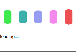
例子二:loading
<head>
<meta charset="utf-8">
<title>loading</title>
<style type="text/css">
@keyframes loading{
    from{
        transform: scale(1,1);
    }
    to{
        transform: scale(1,0.5);
    }
}
.box{
    width: 300px;
    height: 200px;
    border: 1px solid #000;
}
.box div{
    width: 30px;
    height: 100px;
    background-color: gold;
    margin: 15px;
    float: left;
    border-radius: 15px;
    animation: loading 500ms ease infinite alternate;

}
.box div:nth-child(1){                    /*CSS3新增選擇器*/

    background-color: #3DE94C;

}
.box div:nth-child(2){

    background-color: #3DB0AB;
    animation-delay: 100ms;
}
.box div:nth-child(3){

    background-color: #969EF3;
    animation-delay: 200ms;
}
.box div:nth-child(4){

    background-color: #F488ED;
    animation-delay: 300ms;
}
.box div:nth-child(5){

    background-color: #ED4F52;
    animation-delay: 400ms;
}
</style>
</head>
<body>
<div class="box">
    <div ></div>
    <div ></div>
    <div ></div>
    <div ></div>
    <div ></div>
    <p>loading.........</p>
</div>
</body>
2.CSS3新增選擇器
E:nth-child(n):匹配元素類型爲E,且是父元素的第n個。
3.CSS3圓角、rgba
(1)圓角
設置某一個角的圓角,比如設置左上角的圓角:
border-top-left-radius:30px 60px;
同時設置四個角:
border-radius:20px 10px 30px 50px;
設置四個圓角相同:
border-radius:50%;
4.rgba(新的顏色值表示法)
(1)盒子透明表示法:
.box{
width: 300px;
height: 300px;
background-color: #000000;
margin: 50px auto;
    /*透明完整寫法,整個盒子透明*/
    opacity: 0.3;
    filter: alpha(opacity=30);
}
.box01{
    width: 300px;
    height: 300px;
    /*第二種寫法,僅背景透明*/
    background-color: rgba(0,0,0,0.5);
    margin: 50px auto;

    /*透明完整寫法*/
    /*opacity: 0.3;
    filter: alpha(opacity=30);*/
}