


問題:假設高度已知,請寫出三欄佈局,左欄、右欄寬度300px,中間寬度自適應。
實現改佈局的方式有下面五種:
1、浮動方式 ;2、絕對定位方式;3、flex方式 ;4、表格方式–display:table及display:table-cell實現;5、網格佈局方式–display:grid;
接下來通過代碼的方式分別介紹一下這五種實現三欄佈局的方式:
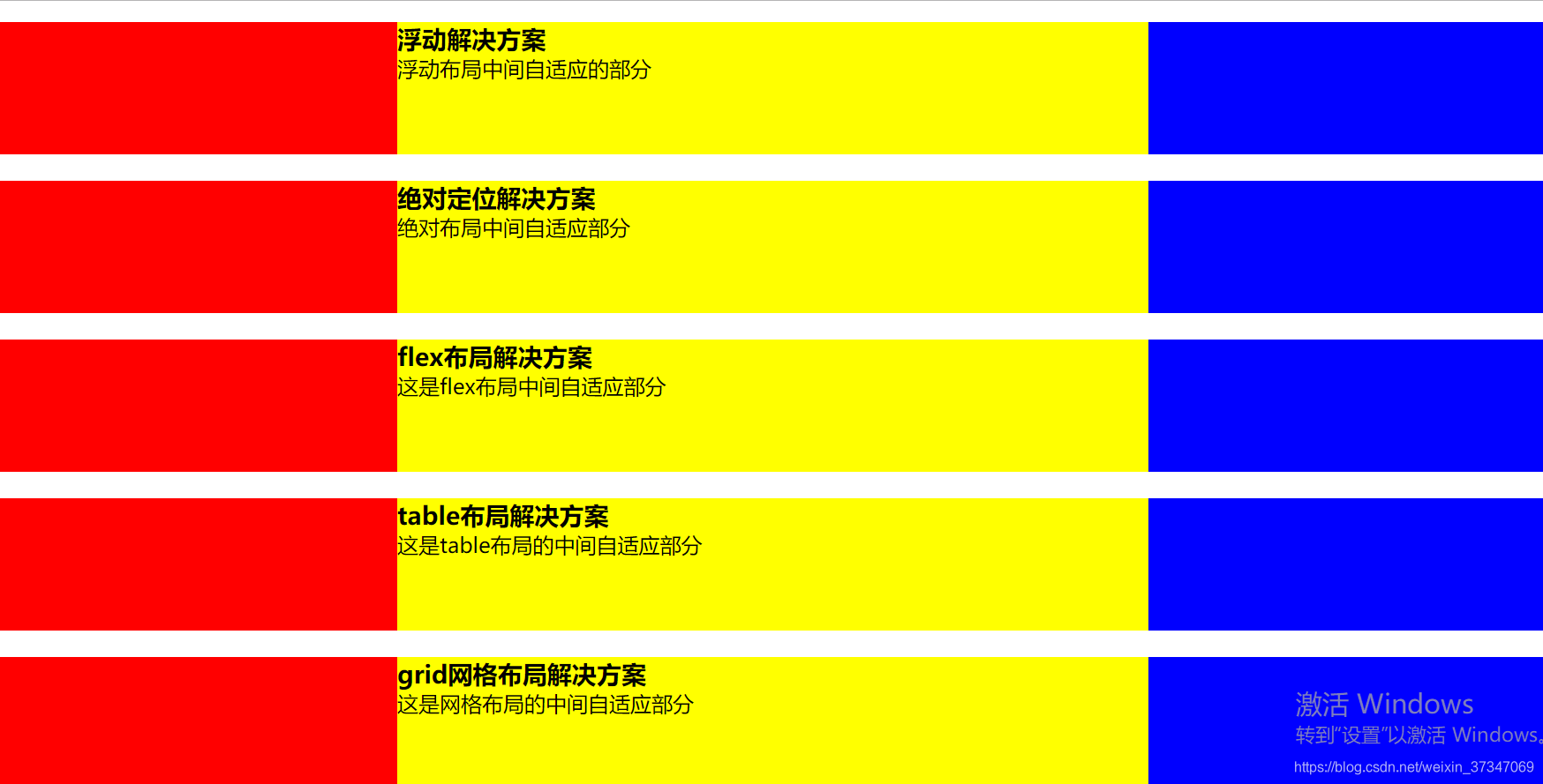
1、浮動佈局方式
<section class='layout float'>
    <style media="screen">
        .layout.float .left{
            width: 300px;
            float: left;
            background: red;
        }
        .layout.float .right{
            width: 300px;
            float: right;
            background: blue;
        }
        .layout.float .center{
           background: yellow;
        }
    </style>
    <article class="left-center-right">
        <div class="left"></div>
        <div class="right"></div>
        <div class="center">
            <h1>浮動解決方案</h1>
            浮動佈局中間自適應的部分
        </div>
    </article>
</section>
浮動元素是脫離文檔流的,所以浮動佈局會存在高度塌陷、例子中當center部分內容超出100px時內容會溢出等問題。
浮動佈局的兼容性比較好,只要做好清除浮動,是沒有什麼問題的。
清除浮動的方式及優缺點
2、絕對定位佈局
<section class='layout absoult'>
    <style media="screen">
        .layout.absoult .left-center-right>div{
           position: absolute;
        }
        .layout.absoult .left{
           left:0;
           width: 300px;
           background: red;
        }
        .layout.absoult .right{
           right:0;
           width: 300px;
           background: blue;
        }
        .layout.absoult .center{
           left:300px;
           right:300px;
           background: yellow;
        }
    </style>
    <article class="left-center-right">
        <div class="left"></div>
        <div class="center">
            <h1>絕對定位解決方案</h1>
            絕對佈局中間自適應部分
        </div>
        <div class="right"></div>
    </article>
</section>
絕對定位佈局優點,很快捷,設置很方便,而且也不容易出問題;缺點就是,絕對定位是脫離文檔流的,意味着下面的所有子元素也會脫離文檔流,這就導致了這種方法的有效性和可使用性是比較差的。
3、flex佈局方式
<section class='layout flex'>
    <style media="screen">
      .layout.flex{
        margin-top:140px;
      }
      .layout.flex .left-center-right{
         display: flex;
      }
      .layout.flex .left{
          width: 300px;
          background: red;
      }
      .layout.flex .right{
          width: 300px;
          background: blue;
      }
      .layout.flex .center{
          background: yellow;
          flex: 1;
      }
    </style>
    <article class="left-center-right">
        <div class="left"></div>
        <div class="center">
             <h1>flex佈局解決方案</h1>
             這是flex佈局中間自適應部分
        </div>
        <div class="right"></div>
    </article>
</section>
felxbox佈局是css3裏新出的一個,它就是爲了解決上述兩種方式的不足出現的,是比較完美的一個。目前移動端的佈局也都是用flexbox。
felxbox的缺點就是不能兼容IE8及以下瀏覽器
4、表格佈局方式
<section class='layout table'>
    <style media="screen">
        .layout.table .left-center-right{
            width:100%;
            display: table;
            height: 100px;
        }
        .layout.table .left-center-right>div{
            display:table-cell;
        }
        .layout.table .left{
            width: 300px;
            background: red;
        }
        .layout.table .center{
            background: yellow;
        }
        .layout.table .right{
            width: 300px;
            background: blue;
        }
    </style>
    <article class="left-center-right">
        <div class="left"></div>
        <div class="center">
            <h1>table佈局解決方案</h1>
            這是table佈局的中間自適應部分
        </div>
        <div class="right"></div>
    </article>
</section>
表格佈局在歷史上遭到很多人的摒棄,說表格佈局麻煩,操作比較繁瑣,其實這是一種誤解,在很多場景中,表格佈局還是很適用的,比如這個三欄佈局,用表格佈局就輕易寫出來了。還有表格佈局的兼容性很好,在flex佈局不兼容的時候,可以嘗試表格佈局。
表格佈局也是有缺陷的,當其中一個單元格高度超出的時候,兩側的單元格也是會跟着一起變高的,而有時候這種效果不是我們想要的。
5、網格佈局方式
網格佈局介紹
<section class='layout grid'>
<style media="screen">
.layout.grid .left-center-right{
display: grid;
grid-template-columns: 300px auto 300px;
}
.layout.grid .left{
background: red;
}
.layout.grid .center{
background: yellow;
}
.layout.grid .right{
background: blue;
}
</style>
<article class="left-center-right">
<div class="left"></div>
<div class="center">
<h1>grid網格佈局解決方案</h1>
這是網格佈局的中間自適應部分
</div>
<div class="right"></div>
</article>
</section>