


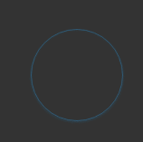
呼吸灯效果是一种常见的灯光效果,比如网页的按钮,现实生活中比如电脑的开机按钮。
使用CSS3的animation方法可以实现很多迷人的网页动画特效。
使用CSS3 配合box-shadow即可实现类似的效果
样式代码如下
1 2 3 4 5 6 7 8 9 10 11 12 13 14 15 16 17 18 19 20 21 22 23 24 25 26 27 28 29 |
 .breathe-div {
    width: 100px;
    height: 100px;
    border: 1px solid #2b92d4;
    border-radius: 50%;
    text-align: center;
    cursor: pointer;
    margin:150px auto;
    box-shadow: 0 1px 2px rgba(0, 0, 0, 0.3);
    overflow: hidden;
    -webkit-animation-timing-function: ease-in-out;
    -webkit-animation-name: breathe;
    -webkit-animation-duration: 1500ms;
    -webkit-animation-iteration-count: infinite;
    -webkit-animation-direction: alternate;
}

@-webkit-keyframes breathe {
    0% {
        opacity: .4;
        box-shadow: 0 1px 2px rgba(0, 147, 223, 0.4), 0 1px 1px rgba(0, 147, 223, 0.1) inset;
    }

    100% {
        opacity: 1;
        border: 1px solid rgba(59, 235, 235, 0.7);
        box-shadow: 0 1px 30px #0093df, 0 1px 20px #0093df inset;
    }
}
|
HTML 代码
1 |
<div class="breathe-div"></div> |