


- 前言
DevExpress 控件的功能比較強大,是全球知名控件開發公司,對於開發 B/S 或 C/S 都非常出色,可以實現很炫且功能強大的效果。DevExpress Winform 常用控件是本人在前幾個項目的一些筆記,在實際的項目中可能會經常涉及到,所以對常用控件的屬性、方法、事件都列舉出來。
- 在 Visual Stuodio 中添加 DevExpress 控件
1. 使用控制檯進入 DevExpress 安裝目錄(輸入命令): cd D:\Program Files (x86)\DevExpress 14.1\Components\Tools
2. 添加 DevExpress 控件:ToolboxCreator.exe/ini:toolboxcreator.ini
3. 移除 DevExpress 控件:ToolboxCreator.exe/ini:toolboxcreator.ini/remove
常見錯誤
1. 在 XtraForm 子窗體繼承父窗體的情況下,調用父窗體的 virtual方法,可能出現如下錯誤(具體原因當時沒有檢查):
運行時遇到了錯誤。此錯誤的地址爲 0xbb70c62f,在線程 0x4364 上。錯誤代碼爲 0xc0000005。此錯誤可能是 CLR 中的 bug,或者是用戶代碼的不安全部分或不可驗證部分中的 bug。此 bug 的常見來源包括用戶對 COM-interop 或 PInvoke 的封送處理錯誤,這些錯誤可能會損壞堆棧。
DevExpress Winfrom 常用控件
1. SimpleButton(普通按鈕)
2. ButtonEdit(編輯按鈕)
3. CheckEdit(複選/單選框)
4. TextEdit(文本框)
5. SpinEdit(數值選擇控件)
6. DateEdit(日期控件)
7. TimeEdit(時間控件)
8. ComboBoxEdit(下拉框)
9. LookUpEdit(下拉列表視圖)
10. LayoutControl(排版控件)
11. SplitContainerControl(分割容器控件)
12. BarManager(菜單控件)
13. XtraScrollableControl 控件
14. TreeList (樹狀列表控件)
15. XtraTabControl(Tab 頁控件)
16. MarqueeProgressBarControl(進度條控件)
17. DXValidationProvider(驗證控件)
1. SimpleButton(普通按鈕)
1) 選擇 SimpleButton
this.simpleButton1.Select();
2. ButtonEdit(編輯按鈕)
1) 設置按鈕文字(替換"...")
this.buttonEdit1.Properties.Buttons.Caption = "請點擊"; //設計器中設置
2) 設置ButtonEdit不可輸入,默認爲 TextEditStyles.Standard(可輸入)
this.buttonEdit1.Properties.TextEditStyle = DevExpress.XtraEditors.Controls.TextEditStyles.DisableTextEditor;
3) 設置按鈕...的樣式,設置 this.buttonEdit1.Properties.Buttons中的Kind屬性,將生成如下代碼:
this.buttonEdit1.Properties.Buttons.AddRange(new DevExpress.XtraEditors.Controls.EditorButton[] {
new DevExpress.XtraEditors.Controls.EditorButton(DevExpress.XtraEditors.Controls.ButtonPredefines.Redo)});
3. CheckEdit(複選/單選框)
1) 單選框
1. 設置爲單選框
this.checkEdit1.Properties.CheckStyle = DevExpress.XtraEditors.Controls.CheckStyles.Radio; //有十幾種樣式
2. 將多個單選框分爲一組
this.checkEdit1.Properties.RadioGroupIndex = 1;
4. TextEdit(文本框)
1) 設置默認值
this.textEdit1.EditValue = "默認值";
2) 設置爲密碼格式
this.textEdit1.Properties.UseSystemPasswordChar = true;
3) 設置密碼字符,系統默認使用"*"字符作爲密碼字符
this.textEdit1.Properties.PasswordChar = '●';
4) 設置爲只讀
this.textEdit1.Properties.ReadOnly = true;
5) 設置只能輸入小數 // mask 面具,面罩的意思
this.textEdit1.Properties.Mask.MaskType = DevExpress.XtraEditors.Mask.MaskType.Numeric;
6) 設置正則表達式驗證
1. 設置只能輸入0~9的整型數字
this.textEdit1.Properties.Mask.MaskType = DevExpress.XtraEditors.Mask.MaskType.RegEx;
this.textEdit1.Properties.Mask.EditMask = "\\d+"; //設置正則表達式
2. 設置只能輸入日期格式
this.textEdit1.Properties.Mask.MaskType = DevExpress.XtraEditors.Mask.MaskType.RegEx;
this.textEdit1.Properties.Mask.EditMask = @"([1-2]\d{3}|[1-2]\d)-(0?[1-9]|1[0-2])-(3[0-1]|[1-2]\d|0?[1-9])";
this.textEdit1.Properties.Mask.ShowPlaceHolders = false; //是否顯示佔位符
this.textEdit1.Properties.Mask.AutoComplete = DevExpress.XtraEditors.Mask.AutoCompleteType.None; //自動完成模式
3. 正則表達式編寫規範
1) 不允許:this.textEdit1.Properties.Mask.EditMask = @"\d{1, 5}"; 可改爲:@"\d{1,5}";
2) 不允許:this.textEdit1.Properties.Mask.EditMask = @"[\w]{1,5}"; 可改爲:@"[0-9a-zA-Z]{1,5}";
4. 注意點:
1) 如果在某一控件中出現正則表達式語法錯誤,程序中會出現 syntax error 的錯誤。例如:
this.textEdit1.Properties.Mask.EditMask = "(0?\\d{1})(";
7) 設置最大字符長度
this.textEdit1.Properties.MaxLength = 18;
8) 設置輸入字符轉大小寫,默認爲 CharacterCasing.Normal(大小寫保持不變)
this.textEdit1.Properties.CharacterCasing = CharacterCasing.Upper;
9) 設置不顯示正則表達式的提示字符
this.textEdit1.Properties.Mask.AutoComplete = DevExpress.XtraEditors.Mask.AutoCompleteType.None;
this.textEdit1.Properties.Mask.ShowPlaceHolders = false;
10) 設置顯示與編輯都以金額顯示
this.txtRtnCash.Properties.DisplayFormat.FormatString = "{0:c}";
this.txtRtnCash.Properties.DisplayFormat.FormatType = DevExpress.Utils.FormatType.Numeric;
this.txtRtnCash.Properties.EditFormat.FormatString = "{0:c}";
this.txtRtnCash.Properties.EditFormat.FormatType = DevExpress.Utils.FormatType.Numeric;
11) 設置顯示/編輯格式化爲日期
this.textEdit1.Properties.DisplayFormat.FormatType = DevExpress.Utils.FormatType.DateTime;
this.textEdit1.Properties.DisplayFormat.FormatString = "yyyy-MM-dd HH:mm:ss:fff";
this.textEdit1.Properties.EditFormat.FormatType = DevExpress.Utils.FormatType.DateTime;
this.textEdit1.Properties.EditFormat.FormatString = "yyyy-MM-dd HH:mm:ss:fff";
this.textEdit1.EditValue = DateTime.Now;
12) EditValue 屬性與 Text 屬性一般情況下,值都是一致。
13) EditValueChanging 與 EditValueChanged 事件
執行順序:EditValueChanging 先,EditValueChanged 後,手動輸入與代碼賦值都是如此。
1. EditValueChanging 事件
private void textEdit1_EditValueChanging(object sender, DevExpress.XtraEditors.Controls.ChangingEventArgs e)

{

    e.Cancel = true;            //可取消值的改變

    object obj1 = e.NewValue;   //新值

    object obj2 = e.OldValue;   //舊值

    object obj3 = this.textEdit1.EditValue; //舊值

    string str1 = this.textEdit1.Text;      //手動輸入時,與e.NewValue一致;代碼賦值時,與e.OldValue一致。

}

2.   EditValueChanged 事件

private void textEdit1_EditValueChanged(object sender, EventArgs e)

{

    object obj1 = this.textEdit1.EditValue; //舊值

    string str1 = this.textEdit1.Text;      //舊值

}
5. SpinEdit(數值選擇控件)
1) 設置不顯示小數點
this.spinEdit1.Properties.IsFloatValue = false; //GridView:DevExpress.XtraEditors.Repository.RepositoryItemSpinEdit.IsFloatValue = false;
2) 格式化以金額顯示(如:¥12.00)
this.spinEdit1.Properties.DisplayFormat.FormatString = "{0:c}";
this.spinEdit1.Properties.DisplayFormat.FormatType = DevExpress.Utils.FormatType.Numeric;
6. DateEdit(日期控件)
1) 設置 DateEdit 不可編輯(如果不讓用戶輸入,可以在 OnKeypress 事件裏寫代碼控制)
this.dateEdit1.Enabled = false;
2) 設置日期值
this.dateEdit1.EditValue = DateTime.Now.ToShortDateString();
3) 設置顯示日期格式
this.dateEdit1.Properties.DisplayFormat.FormatString = "yyyy-MM-dd";
4) 設置編輯日期格式,默認值:"d",日期格式:2014-4-8 (GridView 中的 RepositoryItemDateEdit 也相同)
this.dateEdit1.Properties.Mask.EditMask = "yyyy-MM-dd"; //MM:表示月份
this.dateEdit1.Properties.Mask.UseMaskAsDisplayFormat = true; //默認值:false
5) 是否顯示清除按鈕,默認爲 true,如果設置爲 false,則始終不能清除控件中的值
this.dateEdit1.Properties.ShowClear = false;
6) 獲取值時注意
this.dateEdit1.Text 獲取的始終是界面上的值,而 this.dateEdit1.EditValue獲取的值類似 2015/1/18 00:00:00。
7. TimeEdit(時間控件)
1) 設置 DateEdit 不可編輯(如果不讓用戶輸入,可以在 OnKeypress 事件裏寫代碼控制)
this.timeEdit1.Enabled = false;
2) 設置時間值
this.timeEdit1.EditValue = DateTime.Now.ToShortTimeString();
3) 設置顯示時間格式,注意:"hh:mm:ss"爲12小時制,"HH:mm:ss"爲24小時制。
this.timeEdit1.Properties.DisplayFormat.FormatString = "hh:mm:ss";
4) 設置編輯時間格式,默認值:"T"(24H),時間格式:20:21:36
(GridView 中的 RepositoryItemTimeEdit 也相同)
this.timeEdit1.Properties.Mask.EditMask = "hh:mm:ss"; //mm:表示分鐘
this.timeEdit1.Properties.Mask.UseMaskAsDisplayFormat = true; //默認值:false
8. ComboBoxEdit(下拉框)
1) 下拉框添加項
this.comboBoxEdit1.Properties.Items.Add("item1");
2) 設置下拉框不可編輯,默認爲 TextEditStyles.Standard(可以編輯)
this.comboBoxEdit1.Properties.TextEditStyle = DevExpress.XtraEditors.Controls.TextEditStyles.DisableTextEditor;
3) 獲取下拉框選擇的值
string value1 = this.comboBoxEdit1.EditValue.ToString();
string value2 = this.comboBoxEdit1.SelectedItem.ToString(); //或者
string value3 = this.comboBoxEdit1.Text; //或
9. LookUpEdit(下拉列表視圖)
1) 綁定 LookUpEdit 數據源,與 ComboBoxEdit 的區別是,ComboBoxEdit 沒有ValueMember 和 DisplayMember 屬性,綁定代碼如下:
DataTable dataTable = ComPersonService.QueryDataAll();
DataRow dataRow = dataTable.NewRow();
dataRow["PersonID"] = "selection";
dataRow["PersonName"] = "請選擇";
dataTable.Rows.InsertAt(dataRow, 0);
this.lookUpEdit1.Properties.DataSource = dataTable;
this.lookUpEdit1.Properties.ValueMember = "PersonID";
this.lookUpEdit1.Properties.DisplayMember = "PersonName";
this.lookUpEdit1.EditValue = "selection"; //設定顯示默認項
2) 實現 LookUpEdit 控件綁定 DataTable 中指定的列,注意:必須先數據源後。
this.lookUpEdit1.Properties.PopulateColumns();  //填充列

foreach (DevExpress.XtraEditors.Controls.LookUpColumnInfo lookUpColumnInfo in this.lookUpEdit1.Properties.Columns)

{

    if (lookUpColumnInfo.FieldName == "DepartID")

        lookUpColumnInfo.Caption = "部門編號";

    else if (lookUpColumnInfo.FieldName == "DepartName")

        lookUpColumnInfo.Caption = "部門名稱";

    else

        lookUpColumnInfo.Visible = false;   //將此列設置不顯示

}
3) 設置 LookUpEdit 控件無數據源或者數據源無數據時,顯示的文本,默認爲[EditValue is null]
this.lookUpEdit1.Properties.NullText = "==無數據==";
4) 設置顯示默認項(根據索引或者 ValueMember 的值)
this.lookUpEdit1.ItemIndex = 0;
this.lookUpEdit1.EditValue = "selection"; //或者
5) 獲取選擇的鍵值(ValueMember 的值)
object editValue = this.lookUpEdit1.EditValue;
6) 獲取選擇的顯示值(DisplayMember 的值)
string textValue = this.lookUpEdit1.Text;
7) 設置列自適應寬度
this.lookUpEdit1.Properties.BestFitMode = DevExpress.XtraEditors.Controls.BestFitMode.BestFitResizePopup;
8) 設置列的顯示名稱
this.lookUpEdit1.Properties.Columns["Name"].Caption = "列名";
9) 設置某列是否顯示,默認爲 true
this.lookUpEdit1.Properties.Columns["Group"].Visible = false;
10) 設置顯示列,通常我們綁定的數據源是一個集合或者 DataTable,這時有些多餘的字段我們可能不需要顯示,則可以通過以下方式設置。
1. 未設置時的顯示
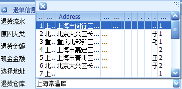
2. 設置後的顯示
![clip_image003[1]](https://img2018.cnblogs.com/blog/654920/201812/654920-20181202172443299-2030517721.png)
3. 我們可以通過視圖編輯器設置,如圖:
![clip_image005[1]](https://img2018.cnblogs.com/blog/654920/201812/654920-20181202172444313-1236688151.jpg)
4. 再編輯列屬性,如圖:
![clip_image007[1]](https://img2018.cnblogs.com/blog/654920/201812/654920-20181202172445107-1418093579.jpg)
5. 關鍵代碼如下:
this.lokRtnStock.Properties.Columns.AddRange(new DevExpress.XtraEditors.Controls.LookUpColumnInfo[] {

new DevExpress.XtraEditors.Controls.LookUpColumnInfo("StockId", "倉庫Id", 20, DevExpress.Utils.FormatType.None, "", false, DevExpress.Utils.HorzAlignment.Default),

new DevExpress.XtraEditors.Controls.LookUpColumnInfo("StockName", "倉庫")});

this.lokRtnStock.Properties.DisplayMember = "StockName";

this.lokRtnStock.Properties.ValueMember = "StockId";
11) 設置下拉顯示行數,默認爲 7
this.lookUpEdit1.Properties.DropDownRows = list.Count;
12) 設置下拉列表大小
this.lookUpEdit1.Properties.PopupFormMinSize = new Size(100, 286);
13) 說明:
1. this.lookUpEdit1.ItemIndex 等於 -1 時,表示不存在數據源。
2. 如果 this.lookUpEdit1.Properties.ReadOnly 等於 true 時, 此時 this.lookUpEdit1.ItemIndex 值是不可改的。
10. LayoutControl(排版控件)
1) LayoutControl
2) LayoutControlGroup
1. 設置 LayoutControlGroup 緊貼 LayoutControl(不留空隙)
this.layoutControlGroup1.EnableIndentsWithoutBorders = DevExpress.Utils.DefaultBoolean.False;
2. 設置 LayoutControlGroup 中的所有 LayoutControlItem 自由寬度
this.layoutControlGroup1.OptionsItemText.TextAlignMode = DevExpress.XtraLayout.TextAlignModeGroup.AutoSize;
3) LayoutControlItem
1. 隱藏文本
this.layoutControlItem1.TextVisible = false;
2. 設置文本的字體顏色
this.layoutControlItem.AppearanceItemCaption.ForeColor = System.Drawing.Color.Red;
this.layoutControlItem.AppearanceItemCaption.Options.UseForeColor = true; //好像可以忽略此設置
3. 隱藏 LayoutControlItem,但是也佔位置
this.layoutControlItem.ContentVisible = false;
4. 隱藏 LayoutControlItem,不佔位置
this.layoutControl1.HiddenItems.AddRange(new DevExpress.XtraLayout.BaseLayoutItem[] { this.layoutControlItem53 });
或者在編輯視圖右鍵 LayoutControlItem,選擇 Hide Item(也是生成一樣的代碼)。
5. 設置 LayoutControlItem 自由寬度
this.layoutControlItem1.TextAlignMode = DevExpress.XtraLayout.TextAlignModeItem.AutoSize;
6. 設置 LayoutControlItem 中的控件最大寬度和高度
this.layoutControlItem1.MaxSize = new System.Drawing.Size(0, 24);
7. 設置 LayoutControlItem 中的控件最小寬度和高度
this.layoutControlItem1.MinSize = new System.Drawing.Size(54, 24);
8. 設置 LayoutControlItem 中的文本與控件的距離,默認爲 4
this.layoutControlItem1.TextToControlDistance = 0;
9. 設置 LayoutControlItem 中的文本居右顯示,默認居左顯示。
注意:需要先設置 TextAlignMode 屬性爲 CustomSize。
this.layoutControlItem1.AppearanceItemCaption.TextOptions.HAlignment = DevExpress.Utils.HorzAlignment.Far;
10. 當 Control 爲 DevExpress.XtraEditors.LabelControl 的相關設置
1) 設置顯示文本
this.layoutControlItem1.TextVisible = true;
2) 設置全局排版寬度不會受 LabelControl.Text 的寬度影響(排版變形),如圖:
![clip_image008[1]](https://img2018.cnblogs.com/blog/654920/201812/654920-20181202172445843-1664721941.png)
this.layoutControlItem1.TextAlignMode = DevExpress.XtraLayout.TextAlignModeItem.CustomSize; //解決以上問題
11. SplitContainerControl(分割容器控件)
1) 設置分割方向(true = 水平分割,false = 垂直分割)
this.splitContainerControl1.Horizontal = false;
2) 設置分割線和邊框
this.splitContainerControl1.BorderStyle = DevExpress.XtraEditors.Controls.BorderStyles.Simple;
3) 設置顯示 Text 文字在頭部
this.splitContainerControl1.ShowCaption = true;
4) 設置不讓其中的 Panel 移動
this.splitContainerControl1.Panel1.MinSize = this.splitContainerControl1.Panel1.Height + 10;
this.splitContainerControl1.Panel2.MinSize = this.splitContainerControl1.Panel2.Height + 10;
5) 設置 SplitContainerControl 大小改變時,不改變大小的 Panel
this.splitContainerControl1.FixedPanel = DevExpress.XtraEditors.SplitFixedPanel.Panel2;
12. BarManager(菜單控件)
1) BarManager
1. 設置菜單項顯示圖片
1) 設置 BarManager 控件需要的圖片控件集合
this.barManager1.Images = this.imageCollection1;
2) 設置菜單項的需要使用到圖片控件集合的索引
this.barButtonItem1.ImageIndex = 3;
2. 設置菜單顯示文字和圖標
this.barButtonItem1.PaintStyle = DevExpress.XtraBars.BarItemPaintStyle.CaptionGlyph;
3. 設置是否允許自定義菜單,默認爲 true
this.barManager1.AllowCustomization = false;
4. 設置是否顯示勾選菜單的選擇框,默認爲 true
this.barManager1.AllowShowToolbarsPopup = false;
5. BarSubItem 菜單項事件
1) Popup 彈出子菜單時觸發。
2) Bar
1. 設置是否可以添加刪除菜單按鈕,默認爲 true
this.bar1.OptionsBar.AllowQuickCustomization = false;
2. 設置菜單的停靠點(可控制是否允許拖動菜單欄),默認爲 All
this.bar1.CanDockStyle = DevExpress.XtraBars.BarCanDockStyle.Top;
3) BarButtonItem
1. 設置菜單項是否顯示(Always 始終顯示 ,Never 永不顯示)
this.barButtonItem1.Visibility = DevExpress.XtraBars.BarItemVisibility.Always;
13. XtraScrollableControl 控件 // 可滾動控件
1) 設置容器內的控件不可用
this.xtraScrollableControl1.Enabled = false;
2) 解決既要有邊框又要有滾動條的需求
設置 panelControl 控件爲父容器(有邊框,無法設置滾動條),在設置 xtraScrollableControl 控件爲子容器(有滾動條,無發設置邊框)。
14. TreeList (樹狀列表控件)
1) 綁定數據源
this.treeList1.KeyFieldName = "Id";
this.treeList1.ParentFieldName = "ParentId";
this.treeList1.DataSource = (List || dataTable);
2) 獲取或設置是否顯示列標題
this.treeList1.OptionsView.ShowColumns = false;
3) 獲取或設置節點是否指示面板顯示(是否顯示指示列(第一列))
this.treeList1.OptionsView.ShowIndicator = false;
4) 獲取或設置是否顯示單個節點(選擇後節點背景色改變)
this.treeList1.OptionsSelection.InvertSelection = true;
5) 獲取或設置選中節點後的背景顏色
this.treeList1.Appearance.FocusedRow.BackColor = Color.Red;
6) 獲取或設置是否顯示垂直線
this.treeList1.OptionsView.ShowVertLines = false;
7) 獲取或設置是否顯示水平線
this.treeList1.OptionsView.ShowHorzLines = false;
8) 事件
1. BeforeExpand:節點展開前
2. AfterExpand:節點展開後
3. BeforeCollapse:節點摺疊前
4. AfterCollapse:節點摺疊後
5. FocusedNodeChanged:節點光標改變時
9) TreeListColumn
1. 獲取或設置顯示列的標題
this.treeListColumn1.Caption = "treeListColumn1";
2. 獲取或設置指定從數據源列的當前字段名稱(設置所綁定數據源的字段名稱)
this.treeListColumn1.FieldName = "Name";
3. 獲取或設置用戶是否防止編輯列的單元格的值(列文本是否只讀)
this.treeListColumn1.OptionsColumn.ReadOnly = true;
4. 獲取或設置用戶是否可以編輯列(不可編輯就不會存在選擇)
this.treeListColumn1.OptionsColumn.AllowEdit = false;
5. 獲取或設置用戶是否可以移動焦點到柱使用鼠標或鍵盤
this.treeListColumn1.OptionsColumn.AllowFocus = false;
15. XtraTabControl(Tab 頁控件)
1) 設置關閉按鈕顯示在右上角
this.xtraTabControl1.HeaderButtons = ((DevExpress.XtraTab.TabButtons)((((DevExpress.XtraTab.TabButtons.Prev | DevExpress.XtraTab.TabButtons.Next) | DevExpress.XtraTab.TabButtons.Close) | DevExpress.XtraTab.TabButtons.Default)));
2) 設置不顯示關閉按鈕
this.xtraTabControl1.ClosePageButtonShowMode = DevExpress.XtraTab.ClosePageButtonShowMode.Default;
1. ClosePageButtonShowMode 枚舉值
1) Default:不顯示關閉按鈕
2) InActiveTabPageAndTabControlHeader:單擊 XtraTabPage 時顯示,鼠標移動到 XtraTabPage 時不顯示,默認顯示第一個,右上角也顯示。
3) InActiveTabPageHeader:單擊 XtraTabPage 時顯示,鼠標移動到 XtraTabPage 時不顯示,默認顯示第一個,右上角不顯示。
4) InActiveTabPageHeaderAndOnMouseHover:關閉按鈕顯示在 XtraTabPage 上,鼠標移動到 XtraTabPage 時不顯示,默認顯示第一個,右上角不顯示。
5) InAllTabPageHeaders:全部 XtraTabPage 顯示,右上角不顯示。
6) InAllTabPagesAndTabControlHeader:全部 XtraTabPage 顯示,右上角也顯示。
7) InTabControlHeader:一個關閉按鈕顯示在右上角。
3) 事件
1. CloseButtonClick,關閉按鈕單擊事件
16. MarqueeProgressBarControl(進度條控件)
MarqueeProgressBarControl 是 DevExpress 的一個進度條控件,該控件和 ProgressBarControl 控件有不少相似之處,不過也是有區別的,MarqueeProgressBarControl只是現實進度的一小部分。
1) 設置進度條是否顯示內容
this.marqueeProgressBarControl1.Properties.ShowTitle = true;
2) 設置進度條顯示內容(該屬性需要同時設置 ShowTitle 爲 true)
this.marqueeProgressBarControl1.Text = "正在加載中...";
3) 獲取或者設置進度條的進度方向
this.marqueeProgressBarControl1.Properties.ProgressKind = DevExpress.XtraEditors.Controls.ProgressKind.Horizontal;
4) 獲取或者設置進度條是否停止,true 表示停止,false 表示運行
this.marqueeProgressBarControl1.Properties.Stopped = false;
5) 設置進度條的速度(值越小速度越快;值越大速度越慢),默認爲 100
this.marqueeProgressBarControl1.Properties.MarqueeAnimationSpeed = 50;
17. DXValidationProvider(驗證控件)
1) 視圖設置驗證控件(設置需要驗證的控件),如圖:
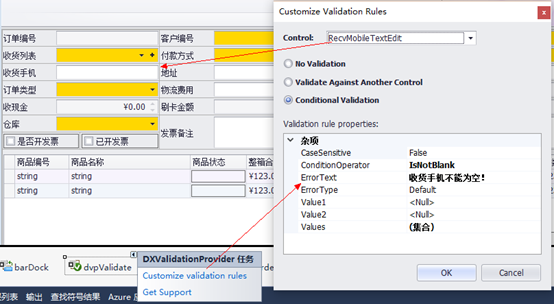
2) 代碼設置驗證控件(其實兩者代碼是一樣的)
DevExpress.XtraEditors.DXErrorProvider.ConditionValidationRule cvr = new DevExpress.XtraEditors.DXErrorProvider.ConditionValidationRule();
cvr.ConditionOperator = DevExpress.XtraEditors.DXErrorProvider.ConditionOperator.IsNotBlank;
cvr.ErrorText = "收貨人不能爲空!";
this.dvpValidate.SetValidationRule(this.SaleByTextEdit, cvr);
3) 在保存數據時,檢查所有設置的控件是否通過驗證。true 表示驗證通過,否則不通過。
this.dvpValidate.Validate();