


前面兩篇文章爲大家詳細講解了相對定位與絕對定位的應用場景和案例。如果想了解的可以在公衆號裏面查看去看。本小節我們學習下固定定位與粘性定位的應用場景和案例。
固定定位
相對於瀏覽器窗口進行定位,其它與絕對定位的特性一致。
常見的應用有:樓梯式導航、瀏覽器右側菜單、底部通欄、全屏黑色半透明遮罩彈出層、彈出註冊和登錄框、左上固定右自適應後臺管理系統佈局
粘性定位
當滾動的高度>元素與瀏覽器的高度時,會以fixed固定定位顯示。
當滾動高度<元素與瀏覽器高度時,會以relative相對定位顯示。
常見的應用有:吸頂盒導航,滾動吸附效果
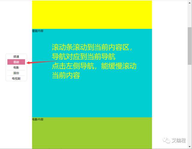
1、樓梯式導航、瀏覽器右側菜單、底部通欄(固定定位應用)
這三個案例用都是用固定定位來控制其與瀏覽器位置。最難是樓梯式導航的js部分
<style>
       body,ul,li{
           margin:0;
           padding: 0;
      }
       .header,.footer{
           height: 200px;
           background-color: skyblue;
      }
       .container{
           width: 1280px;
           margin:20px auto;
      }
       .container .item:nth-child(odd){
           height:600px;
           background-color:yellow;
      }
       .container .item:nth-child(even){
           height:700px;/*代碼來自-艾編程-清心*/
           background-color:darkturquoise;
      }
       ul.louti{
           list-style: none;
           width: 100px;
           padding:0px 10px;
           border: 1px solid #ddd;
           border-radius: 10px;
           background-color: #fff;
           position: fixed;/*通過固定定位來控制樓梯式導航的位置*/
           top:300px;
           left:50px;
      }
       ul.louti li{
           height: 30px;
           line-height: 30px;
           text-align: center;
           border-bottom:1px solid #ddd;
           cursor: pointer;
      }
       ul.louti li:last-child{
           border:none;
      }
       ul.louti li.current{
           background-color: palevioletred;
           color:#fff;
      }
   </style>
<body>
   <div class="header"></div>
   <div class="container">
       <div class="item">頻道內容</div>
       <div class="item">番劇內容</div>
       <div class="item">電影內容</div>
       <div class="item">國創內容</div>
       <div class="item">電視劇內容</div>
   </div>
   <div class="footer"></div>
   <ul class="louti"><!--樓梯式導航 固定定位-->
       <li class="current">頻道</li>
       <li>番劇</li>
       <li>電影</li>
       <li>國創</li>
       <li>電視劇</li>
   </ul>
</body><script>
var itemTop=[];//用來保存每個區塊與頁面頂部距離
var itemHeight=[]
var oItem=document.querySelectorAll('.container .item')
var oLi=document.querySelectorAll('.louti li');
var len=oItem.length;
var dirSpeed=20;//定義方向和速度
var flag=-1;//提高性能優化標籤
var scrollTop=0;//保存瀏覽器滾動高
var timer=null;//全局定時器
//把每個盒子與瀏覽器頂部距離,和高度分別保存到數組中
for(var i=0;i<len ;i++){
itemTop.push(oItem[i].offsetTop);
itemHeight.push(oItem[i].clientHeight);
}
window.onscroll=function(){//滾動瀏覽器滾動條
//獲取滾動條滾動的高度
scrollTop=document.documentElement.scrollTop || document.body.scrollTop;
for(var i=0;i<len;i++){
if(parseInt(scrollTop)<=parseInt(itemTop[i]+itemHeight[i]/3)){
break;
}/*代碼來自-艾編程-清心*/
}
if(flag!=i){//如果在當前樓層滾動,則不會重複執行代碼
flag=i;
for(var j=0;j<len;j++){
oLi[j].className='';
}
oLi[i].className='current';
}
}
for(var j=0;j<oLi.length;j++){
oLi[j].index=j;//保存序列號,後面方便使用
oLi[j].onclick=function(){//給導航加點擊事件
clearInterval(timer);//清除定時器
var that=this;//保存this
//首先要獲取當前滾動條高度
scrollTop=document.documentElement.scrollTop || document.body.scrollTop;
scrollTop>=itemTop[that.index]+itemHeight[that.index]/3?dirSpeed=-20:dirSpeed=20;
timer=setInterval(function(){/*代碼來自-艾編程-清心*/
scrollTop+=dirSpeed;
if(scrollTop<=itemTop[that.index]+itemHeight[that.index]/3 && dirSpeed<0 || scrollTop>=itemTop[that.index]+itemHeight[that.index]/3 && dirSpeed>0){
scrollTop=itemTop[that.index]+itemHeight[that.index]/3;
clearInterval(timer);
}
(document.documentElement.scrollTop=scrollTop) || (document.body.scrollTop=scrollTop);
},5)
}
}
</script>2、視頻彈窗播放效果(固定定位應用)
這個效果中黑色的半透明遮罩層和彈出的視頻都是相對於瀏覽器來固定定位的。彈出登錄註冊框的原理和這個是一樣的。這裏以相對較爲複雜的視頻彈窗效是爲例來講解。
<style>
       .video{
           width:300px;
           height: 200px;
      }
       .video img{
           width: 100%;
           height: 100%;
           object-fit: cover;
           cursor: pointer;
      }
       .mask{
           background-color: rgba(0,0,0,0.5);
           position: fixed;
           top:0px;
           bottom:0px;
           left:0px;
           right:0px;
           display: none;
      }
       .mask video{
           position: fixed;
           left:50%;
           top:50%;
           transform:translateX(-50%) translateY(-50%);
      }
   </style>
<body>
   <!--視頻播放列表-->
   <div class="video"><!--data-src放着對應的視頻地址-->
       <img src='images/mz8.jpg' data-src="mp4/meizu.mp4"></video>
   </div>
   <div class="mask"><!--黑色半透明遮罩層-->
       <video src="" controls width="70%"></video><!--視頻-->
   </div>
   <script>
       var img=document.querySelector('.video img');
       var mask=document.querySelector('.mask');
       var video=document.querySelector('.mask video')
       img.onclick=function(){
           mask.style.display='block';
           video.src=this.dataset.src;//將視頻地址賦值給視頻播放器
           //視頻彈出後,立馬自動播放
           video.play();
      }
   </script>
</body>
3、左邊和頂部固定,右自適應後臺管理界面佈局
(固定定位應用)
頂部導航和左側菜單相對於瀏覽器固定定位。右側的內容區則自適應瀏覽器的寬度
<style>
body{
margin:0;
}
.top{
height: 100px;
position: fixed;/*固定定位 要實現水平自適應,就不要加寬*/
left:10px;
right:10px;
top:0px;
background-color: pink;
border-radius: 10px;
}
.siderbar{
width: 250px;
position: fixed;/*固定定位 要實現垂直自適應,就不要加高*/
left:10px;
top:110px;
bottom:10px;
background-color: pink;
border-radius: 10px;
}
.main{
margin:110px 10px 0px 270px;/*水平自適應,不要加寬*/
min-height:900px;
background-color: skyblue;
}
</style>
<body>
<div class="top"></div><!--頂部-->
<div class="siderbar"></div><!--左側邊欄-->
<div class="main"></div><!--主內容區-->
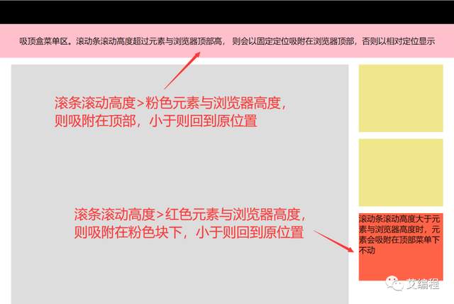
</body>4、吸頂盒導航和常見左右吸附效果(粘性定位)
由於粘性定義目前只有火狐和Safari瀏覽器支持,但是這種效果在實際企業開發中必用。所以我們通常會用JS來實現,以下是完整效果的源碼。
<style>
   body{
       margin: 0;
       min-width: 1280px;
  }
   .top{
       height: 70px;
       width: 100%;
       background-color: #000;
  }
   .header{
       height: 100px;
       width:100%;
       background-color: pink;
       /* position: sticky; 兼容問題
      position: -webkit-sticky; */
       top:0;
       text-align: center;
       line-height: 100px;
  }
   .container{
       width: 1280px;
       margin:20px auto;
  }/*代碼來自-艾編程-清心*/
   .container .main{
       width:1000px;
       min-height: 2000px;
       background-color: #ddd;
       float:left;
  }
   .container .siderbar{
       width:250px;
       float:right;
  }
   .container .siderbar .item{
       height: 200px;
       background-color: khaki;
       margin-bottom:20px;
  }
   .container .siderbar .ceiling{
       height: 200px;
       width: 250px;
       background-color: tomato;
       /* position: sticky;
      position: -webkit-sticky; */
  }
</style>
<body>
   <div class="top"></div>
   <div class="header"></div> <!--吸附塊-->
   <div class="container">
       <div class="main"></div>
       <div class="siderbar">
           <div class="item"></div>
           <div class="item"></div>
           <div class="ceiling"></div> <!--吸附塊-->
       </div>
   </div>
   <script>
       var header=document.querySelector('.header');
       var ceiling=document.querySelector('.ceiling');
       var _top=header.offsetTop;/*元素與瀏覽器頂部距離*/
       var _top2=ceiling.offsetTop-header.clientHeight-110;//這裏要記得減掉header高度和與頂部高度,因爲header在前,定位後不佔空間
       console.log(_top2)
       window.onscroll=function(){
           var scrollTop=document.documentElement.scrollTop || document.body.scrollTop;
           console.log(scrollTop)
           scrollTop>=_top?(header.style.position='fixed'):(header.style.position='relative');
           if(scrollTop>=_top2){/*代碼來自-艾編程-清心*/
               ceiling.style.position='fixed';/*設置固定定位*/
               ceiling.style.top="110px";/*top值*/
          }else{
               ceiling.style.position='relative';
               ceiling.style.top='0px';
          }
      }
   </script>
</body>
爲幫助到一部分同學不走彎路,真正達到一線互聯網大廠前端項目研發要求,首次實力寵粉,打造了《30天挑戰學習計劃》,內容如下:
HTML/HTML5,CSS/CSS3,JavaScript,真實企業項目開發,雲服務器部署上線,從入門到精通
- PC端項目開發(1個)
- 移動WebApp開發(2個)
- 多端響應式開發(1個)
共4大完整的項目開發 !一行一行代碼帶領實踐開發,實際企業開發怎麼做我們就是怎麼做。從學習一開始就進入工作狀態,省得浪費時間。
從學習一開始就同步使用 Git 進行項目代碼的版本的管理,Markdown 記錄學習筆記,包括真實大廠項目的開發標準和設計規範,命名規範,項目代碼規範,SEO優化規範
從藍湖UI設計稿 到 PC端,移動端,多端響應式開發項目開發
- 真機調試,雲服務部署上線;
- Linux環境下 的 Nginx 部署,Nginx 性能優化;
- Gzip 壓縮,HTTPS 加密協議,域名服務器備案,解析;
- 企業項目域名跳轉的終極解決方案,多網站、多系統部署;
- 使用 使用 Git 在線項目部署;
這些內容在《30天挑戰學習計劃》中每一個細節都有講到,包含視頻+圖文教程+項目資料素材等。只爲實力寵粉,真正一次掌握企業項目開發必備技能,不走彎路 !
過程中【不涉及】任何費用和利益,非誠勿擾 。
如果你沒有添加助理老師微信,可以添加下方微信,說明要參加30天挑戰學習計劃,來自博客園!老師會邀請你進入學習,並給你發放相關資料