


您好,歡迎關注我,本篇文章是關於 Flutter 的系列文,從簡單的 Flutter 介紹開始,一步步帶你瞭解進入 Flutter 的世界。你最好有一定的移動開發經驗,如果沒有也不要擔心,在我的專欄底部給我留言,我會盡我的能力給你解答。
上篇文章我們介紹了Flutter的整體架構,相信大家一定印象深刻,本篇文章介紹 Flutter UI的基礎構建,從主題、提示、圖片加載和動畫四個方向介紹。
一.使用主題管理顏色和字體樣式
使用主題可以在應用中採用統一的顏色和樣式。定義主題有兩種方式:內建主題或自定義Theme類。
1.內建主題
new MaterialApp(
  title: title,
  theme: new ThemeData(
    brightness: Brightness.dark,
    primaryColor: Colors.lightBlue[800],
    accentColor: Colors.cyan[600],
  ),
);
2.自定義主題
new Theme(
  // Create a unique theme with "new ThemeData"
  data: new ThemeData(
    accentColor: Colors.yellow,
  ),
);
3.使用主題
通過以上兩種方式創建主題後,我們可以在Widget的build方法中通過Theme.of(context)函數使用主題。
new Container(
  color: Theme.of(context).accentColor,
  child: new Text(
    'Text with a background color',
    style: Theme.of(context).textTheme.title,
  ),
);
通過ThemeData文檔可以查看到主題裏面支持預定義的顏色
通過TextTheme可以查看系統預製的字體樣式。例如示例中提到的theme.textTheme.title就是這個樣子的:
SnackBar
在Android中有Toast彈出提示這個概念,但是在Flutter中沒有Toast,取而代之的是SnackBar。
想要創建一個SnackBar,我們需要用到Scaffold容器,之前文章有講過Scaffold是一個包含Material Design的容器。
Scaffold(
  appBar: AppBar(
    title: Text('SnackBar Demo'),
  ),
  body: SnackBarPage(), // We'll fill this in below!
);
接下來創建一個按鈕:
return Center(
      child: RaisedButton(
        onPressed: _showSnackBar,
        child: Text('Show SnackBar'),
      ),
    );
點擊按鈕的時候顯示SnackBar:
void _showSnackBar() {
    final snackBar = SnackBar(
            content: Text('Yay! A SnackBar!'),
            action: SnackBarAction(
              label: 'Undo',
              onPressed: () {
                // Some code to undo the change!
              },
            ),
          );

    Scaffold.of(context).showSnackBar(snackBar);
}
二.從網絡加載圖片
在Flutter中直接使用Image.network就可以加載圖片了
import 'package:flutter/material.dart';

void main() => runApp(MyApp());

class MyApp extends StatelessWidget {
  @override
  Widget build(BuildContext context) {
    var title = 'Web Images';

    return MaterialApp(
      title: title,
      home: Scaffold(
        appBar: AppBar(
          title: Text(title),
        ),
        body: Image.network(
          'https://github.com/flutter/website/blob/master/_includes/code/layout/lakes/images/lake.jpg?raw=true',
        ),
      ),
    );
  }
}
該方法還可以直接加載GIF圖片
Image.network(
  'https://github.com/flutter/plugins/raw/master/packages/video_player/doc/demo_ipod.gif?raw=true',
);
通過placeholder屬性可以增加一個佔位圖:
FadeInImage.assetNetwork(
  placeholder: 'assets/loading.gif',
  image: 'https://github.com/flutter/website/blob/master/_includes/code/layout/lakes/images/lake.jpg?raw=true',
);
值得注意的是用Image.network加載的圖片並沒有緩存,如果想加載圖片並緩存,需要使用:
CachedNetworkImage(
  placeholder: CircularProgressIndicator(),
  imageUrl: 'https://github.com/flutter/website/blob/master/_includes/code/layout/lakes/images/lake.jpg?raw=true',
);
如果對Flutter的圖片緩存策略感興趣,請繼續關注本專欄,之後的文章中我會分享給大家
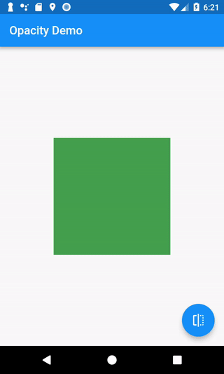
三.動畫
本段只簡單的介紹動畫入門,之後有文章會詳細介紹Flutter動畫。
上篇文章說到過在Flutter中所有的東西都是Widget,包括動畫也不例外,如果你想讓某個Widget包含動畫屬性,那麼你需要用AnimatedOpacity將其包裹起來,AnimatedOpacity也是一個Widget。
AnimatedOpacity(
  // If the Widget should be visible, animate to 1.0 (fully visible). If
  // the Widget should be hidden, animate to 0.0 (invisible).
  opacity: _visible ? 1.0 : 0.0,
  duration: Duration(milliseconds: 500),
  // The green box needs to be the child of the AnimatedOpacity
  child: Container(
    width: 200.0,
    height: 200.0,
    color: Colors.green,
  ),
);
我們使用一個StatefulWidget來調用setState()方法刷新_visible的值,就能顯示動畫了,是不是很簡單?
import 'package:flutter/material.dart';

void main() => runApp(MyApp());

class MyApp extends StatelessWidget {
  @override
  Widget build(BuildContext context) {
    final appTitle = 'Opacity Demo';
    return MaterialApp(
      title: appTitle,
      home: MyHomePage(title: appTitle),
    );
  }
}

// The StatefulWidget's job is to take in some data and create a State class.
// In this case, our Widget takes in a title, and creates a _MyHomePageState.
class MyHomePage extends StatefulWidget {
  final String title;

  MyHomePage({Key key, this.title}) : super(key: key);

  @override
  _MyHomePageState createState() => _MyHomePageState();
}

// The State class is responsible for two things: holding some data we can
// update and building the UI using that data.
class _MyHomePageState extends State<MyHomePage> {
  // Whether the green box should be visible or invisible
  bool _visible = true;

  @override
  Widget build(BuildContext context) {
    return Scaffold(
      appBar: AppBar(
        title: Text(widget.title),
      ),
      body: Center(
        child: AnimatedOpacity(
          // If the Widget should be visible, animate to 1.0 (fully visible). If
          // the Widget should be hidden, animate to 0.0 (invisible).
          opacity: _visible ? 1.0 : 0.0,
          duration: Duration(milliseconds: 500),
          // The green box needs to be the child of the AnimatedOpacity
          child: Container(
            width: 200.0,
            height: 200.0,
            color: Colors.green,
          ),
        ),
      ),
      floatingActionButton: FloatingActionButton(
        onPressed: () {
          // Make sure we call setState! This will tell Flutter to rebuild the
          // UI with our changes!
          setState(() {
            _visible = !_visible;
          });
        },
        tooltip: 'Toggle Opacity',
        child: Icon(Icons.flip),
      ), // This trailing comma makes auto-formatting nicer for build methods.
    );
  }
}
本篇文章從主題、提示、圖片加載和動畫四個方面簡單的介紹了Flutter的UI創建過程,爲了避免文章太長導致可讀性較差,所以只簡單的講了這四個方面,還有更多內容會在之後的文章裏介紹。相信本篇文章讀完之後,你已經知道如何使用Flutter Widget了,下一篇專欄來點實戰,我會教大家如何實現一個輪播指示器。