Matplotlib
Matplotlib 是一個 Python 的 2D繪圖庫,通過 Matplotlib,開發者可以僅需要幾行代碼,便可以生成繪圖,直方圖,功率譜,條形圖,錯誤圖,散點圖等。
- 用於創建出版質量圖表的繪圖工具庫
- 目的是爲Python構建一個Matlab式的繪圖接口
- import matplotlib.pyplot as plt
- pyplot模塊包含了常用的matplotlib API函數
figure
- Matplotlib的圖像均位於figure對象中
- 創建figure:fig = plt.figure()
示例代碼:
# 引入matplotlib包
import matplotlib.pyplot as plt
import numpy as np

%matplotlib inline #在jupyter notebook 裏需要使用這一句命令

# 創建figure對象
fig = plt.figure()
運行結果:會彈出一個figure窗口,如下圖所示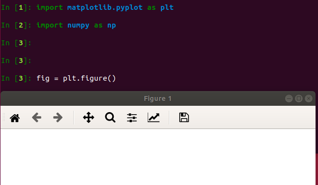
subplot
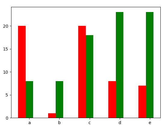
fig.add_subplot(a, b, c)
- a,b 表示將fig分割成 a*b 的區域
- c 表示當前選中要操作的區域,
- 注意:從1開始編號(不是從0開始)
- plot 繪圖的區域是最後一次指定subplot的位置 (jupyter notebook裏不能正確顯示)
示例代碼:
# 指定切分區域的位置
ax1 = fig.add_subplot(2,2,1)
ax2 = fig.add_subplot(2,2,2)
ax3 = fig.add_subplot(2,2,3)
ax4 = fig.add_subplot(2,2,4)

# 在subplot上作圖
random_arr = np.random.randn(100)
#print random_arr

# 默認是在最後一次使用subplot的位置上作圖,但是在jupyter notebook 裏可能顯示有誤
plt.plot(random_arr)

# 可以指定在某個或多個subplot位置上作圖
# ax1 = fig.plot(random_arr)
# ax2 = fig.plot(random_arr)
# ax3 = fig.plot(random_arr)

# 顯示繪圖結果
plt.show()
運行結果:僅右下角有圖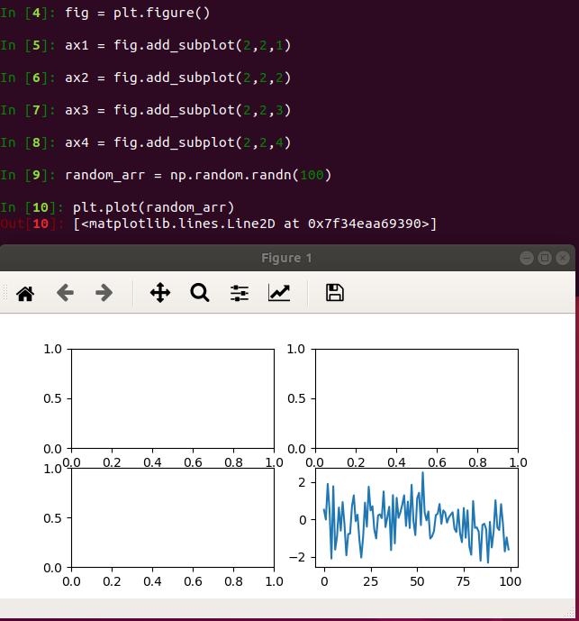
直方圖:hist
示例代碼:
import matplotlib.pyplot as plt
import numpy as np

plt.hist(np.random.randn(100), bins=10, color='b', alpha=0.3)
plt.show()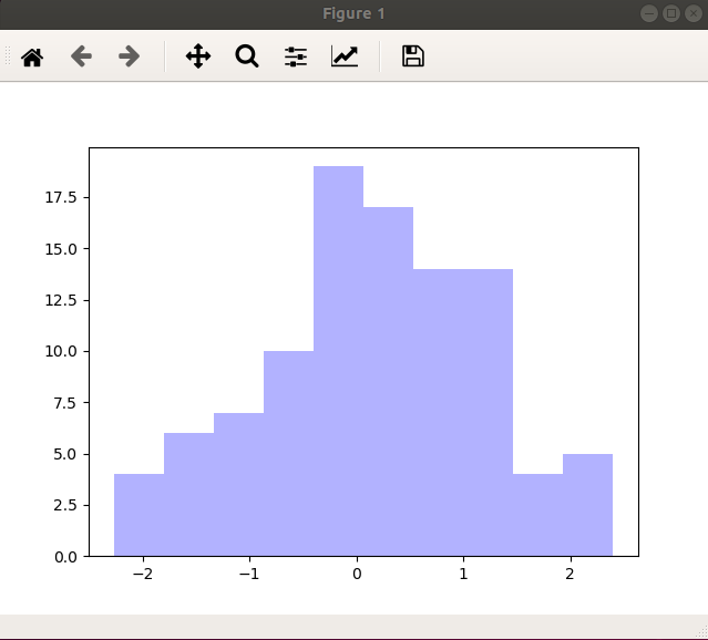
散點圖:scatter
示例代碼:
import matplotlib.pyplot as plt
import numpy as np

# 繪製散點圖
x = np.arange(50)
y = x + 5 * np.random.rand(50)
plt.scatter(x, y)
plt.show()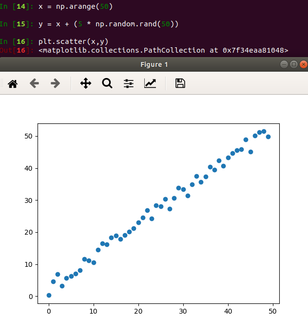
柱狀圖:bar
示例代碼:
import matplotlib.pyplot as plt
import numpy as np

# 柱狀圖
x = np.arange(5)
y1, y2 = np.random.randint(1, 25, size=(2, 5))
width = 0.25
ax = plt.subplot(1,1,1)
ax.bar(x, y1, width, color='r')
ax.bar(x+width, y2, width, color='g')
ax.set_xticks(x+width)
ax.set_xticklabels(['a', 'b', 'c', 'd', 'e'])
plt.show()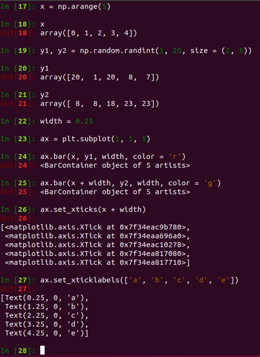
矩陣繪圖:plt.imshow()
- 混淆矩陣,三個維度的關係
示例代碼:
import matplotlib.pyplot as plt
import numpy as np

# 矩陣繪圖
m = np.random.rand(10,10)
print(m)
plt.imshow(m, interpolation='nearest', cmap=plt.cm.ocean)
plt.colorbar()
plt.show()
plt.subplots()
- 同時返回新創建的figure和subplot對象數組
- 生成2行2列subplot:fig, subplot_arr = plt.subplots(2,2)
- 在jupyter裏可以正常顯示,推薦使用這種方式創建多個圖表
示例代碼:
import matplotlib.pyplot as plt
import numpy as np

fig, subplot_arr = plt.subplots(2,2)
# bins 爲顯示個數,一般小於等於數值個數
subplot_arr[1,0].hist(np.random.randn(100), bins=10, color='b', alpha=0.3)
plt.show()
運行結果:左下角繪圖
顏色、標記、線型
- ax.plot(x, y, ‘r--’)
等價於ax.plot(x, y, linestyle=‘--’, color=‘r’)
示例代碼:
import matplotlib.pyplot as plt
import numpy as np

fig, axes = plt.subplots(2)
axes[0].plot(np.random.randint(0, 100, 50), 'ro--')
# 等價
axes[1].plot(np.random.randint(0, 100, 50), color='r', linestyle='dashed', marker='o')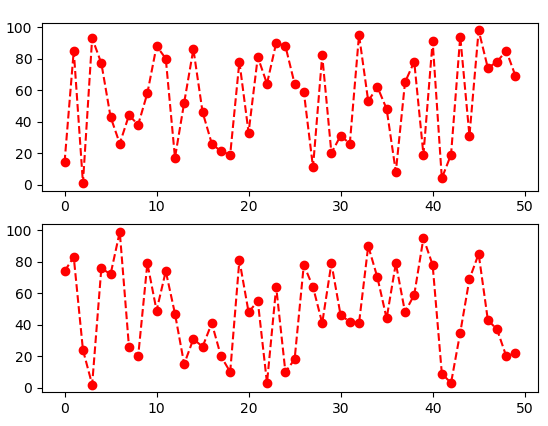
- 常用的顏色、標記、線型
顏色
-
- b: blue
-
- g: grean
-
- r: red
-
- c: cyan
-
- m: magenta
-
- y: yellow
-
- k: black
-
- w: white
標記
-
- .: point
-
- ,: pixel
-
- o: circle
-
- v: triangle_down
-
- ^: triangle_up
-
- <: tiiangle_left
線型
-
- '-' or 'solid': solid lint
-
- '--' or 'dashed': dashed line
-
- '-.' or 'dashdot': dash-dotted line
-
- ':' or 'dotted': dotted line
-
- 'None': draw nothing
-
- ' ': draw nothing
-
- '': draw nothing
刻度、標籤、圖例
-
設置刻度範圍
plt.xlim(), plt.ylim()
ax.set_xlim(), ax.set_ylim()
-
設置顯示的刻度
plt.xticks(), plt.yticks()
ax.set_xticks(), ax.set_yticks()
-
設置刻度標籤
ax.set_xticklabels(), ax.set_yticklabels()
-
設置座標軸標籤
ax.set_xlabel(), ax.set_ylabel()
-
設置標題
ax.set_title()
- 圖例
ax.plot(label=‘legend’)
ax.legend(), plt.legend()
loc=‘best’:自動選擇放置圖例最佳位置
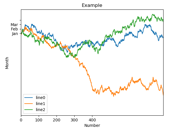
示例代碼:
import matplotlib.pyplot as plt
import numpy as np

fig, ax = plt.subplots(1)
ax.plot(np.random.randn(1000).cumsum(), label='line0')

# 設置刻度
#plt.xlim([0,500])
ax.set_xlim([0, 800])

# 設置顯示的刻度
#plt.xticks([0,500])
ax.set_xticks(range(0,500,100))

# 設置刻度標籤
ax.set_yticklabels(['Jan', 'Feb', 'Mar'])

# 設置座標軸標籤
ax.set_xlabel('Number')
ax.set_ylabel('Month')

# 設置標題
ax.set_title('Example')

# 圖例
ax.plot(np.random.randn(1000).cumsum(), label='line1')
ax.plot(np.random.randn(1000).cumsum(), label='line2')
ax.legend()
ax.legend(loc='best')
#plt.legend()